Last updated: August 6, 2026
The cutest front door paint colors are the exterior-safe shades you choose for your entry door to boost curb appeal and make your home look more intentional. The simplest default approach is to pick one classic, neighborhood-friendly color (like black, deep navy, or charcoal) in an exterior satin finish and plan on 2 coats for even coverage.
30 Front Door Paint Colors Ideas
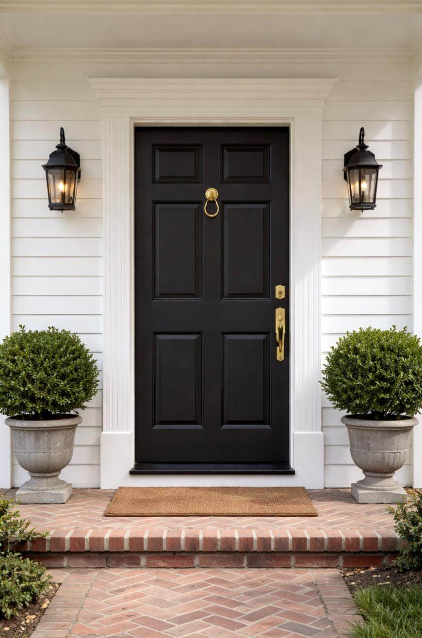
1. Classic Black
Black gives you instant contrast and works with nearly every siding and brick tone.
Pick a slightly softened “off-black” if your trim is creamy so the door does not look harsh.
2. Deep Navy
Deep navy reads polished like black but feels a touch more welcoming and modern.
If your house is mostly white or light gray, navy will look especially crisp and expensive.

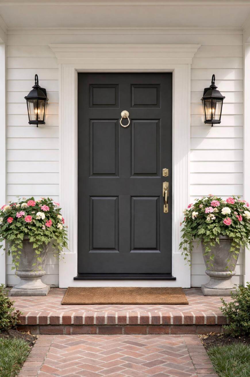
3. Charcoal Gray
Charcoal is a safe, architectural choice that hides scuffs better than true black.
Use a satin sheen if you want it to look clean without highlighting brush marks.
4. Warm Greige
Warm greige is the “blends-in-but-better” option when you want subtle curb appeal.
This is a smart pick if your stone or brick has both warm and cool flecks.
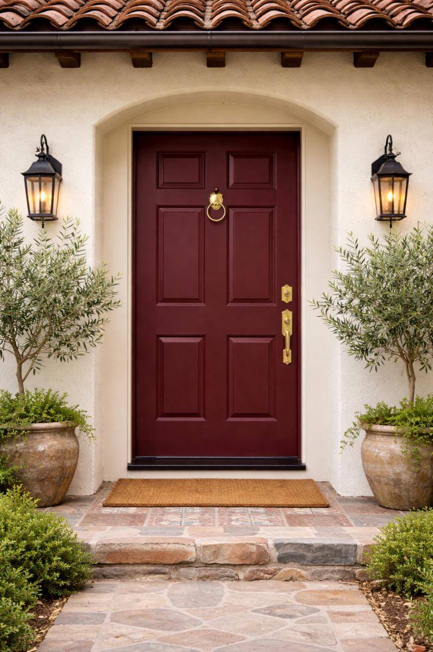
5. Crisp True White
A white door can look fresh and coastal when the rest of the exterior has enough contrast.
Choose white only if you can commit to occasional wipe-downs, because it shows grime fast.
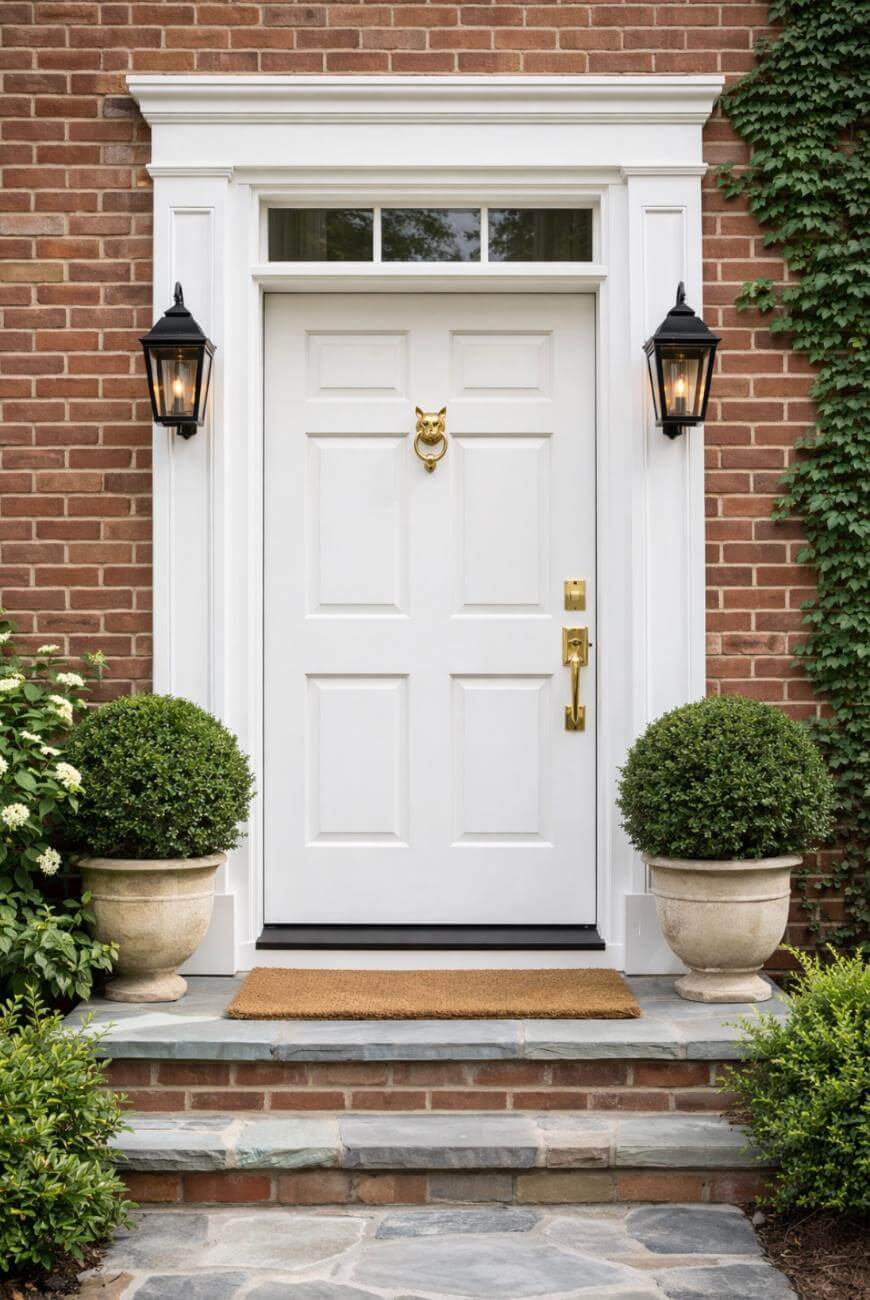
6. Creamy Ivory
Ivory feels softer than bright white and pairs beautifully with warm brick and beige siding.
Match the undertone to your trim so the door does not look yellow by comparison.
7. Forest Green
Forest green feels classic and grounded, especially with brick, stone, and natural landscaping.
If your home has a lot of warm red brick, forest green is one of the easiest “just works” options.
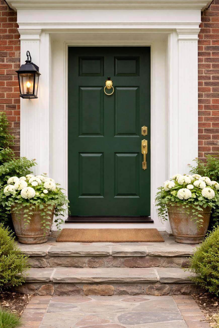
8. Deep Olive
Deep olive gives you a designer look without being loud or trendy.
It looks best when you echo it with black hardware or warm brass for balance.
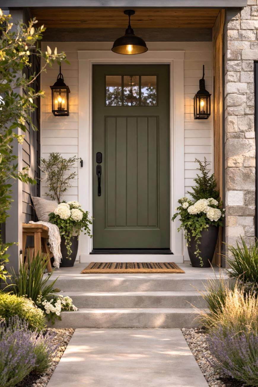
9. Sage Green
Sage is calm and inviting, and it softens harsh modern exteriors.
If your porch gets strong sun, pick a slightly deeper sage so it does not wash out.
10. Hunter Green
Hunter green reads traditional and upscale, especially on colonials and cottages.
Add a brass knocker or handle set to make the color feel intentional instead of dark.
11. Burgundy
Burgundy adds warmth and heritage style without drifting into “bright red” territory.
It pairs especially well with cream trim and darker, older brick.
12. Oxblood
Oxblood feels rich and historic, like a built-in focal point that still looks timeless.
Keep the surrounding decor simple so the door stays the star.
13. Brick Red
Brick red can look cohesive and classic when you want color that still feels grounded.
If your home already has red brick, choose a red with a slightly different depth so it does not clash.
14. True Red
A true red door reads bold and cheerful, especially on neutral houses.
Use it when you want a statement and you are willing to keep your porch decor more restrained.
15. Terracotta
Terracotta is warm and earthy and looks amazing with stucco, stone, and desert landscaping.
Choose a deeper terracotta if you have a lot of beige so it does not look too orange.
16. Burnt Orange
Burnt orange feels energetic and modern, especially on mid-century style homes.
Pair it with matte black hardware to keep it from skewing too playful.
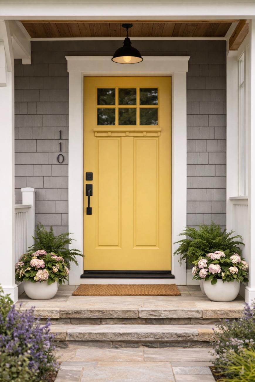
17. Mustard Yellow
Mustard yellow adds personality while still feeling grown-up and curated.
It tends to look best with darker trim (black or charcoal) rather than bright white.
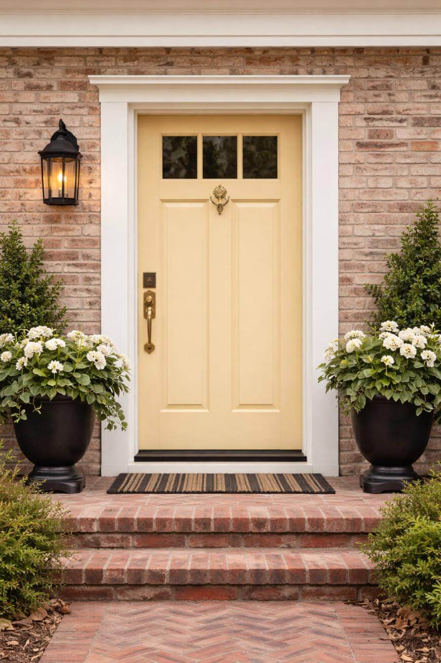
18. Butter Yellow
Butter yellow is sunny and welcoming, perfect for traditional or farmhouse exteriors.
If your siding is cream, go deeper so the door does not disappear.
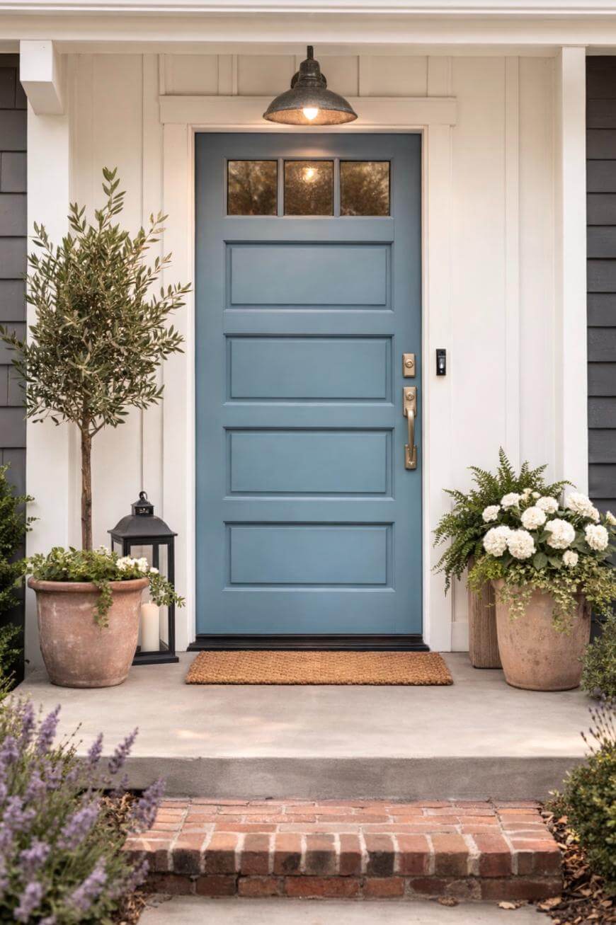
19. Dusty Blue
Dusty blue gives you color without the intensity of bright teal or royal blue.
It works especially well with gray siding and white trim for an easy coastal look.
20. Slate Blue
Slate blue reads calm and sophisticated, with a hint of stormy drama.
Choose it if you want a color that feels interesting but still resale-friendly.
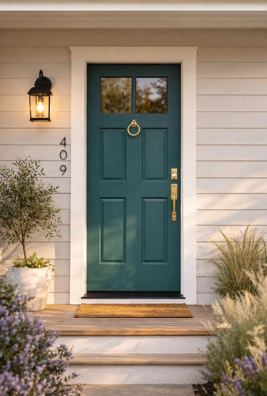
21. Teal
Teal is playful and fresh, and it can make a simple exterior look custom.
Keep your house numbers and light fixtures simple so the look stays clean.
22. Peacock Blue
Peacock blue is jewel-toned and striking, especially with white, tan, or warm gray exteriors.
Use it when you want a “wow” color that still looks classic with the right hardware.
23. Turquoise
Turquoise feels bright and happy, especially in sunny climates and near water.
Pick a slightly muted turquoise if your neighborhood leans traditional.
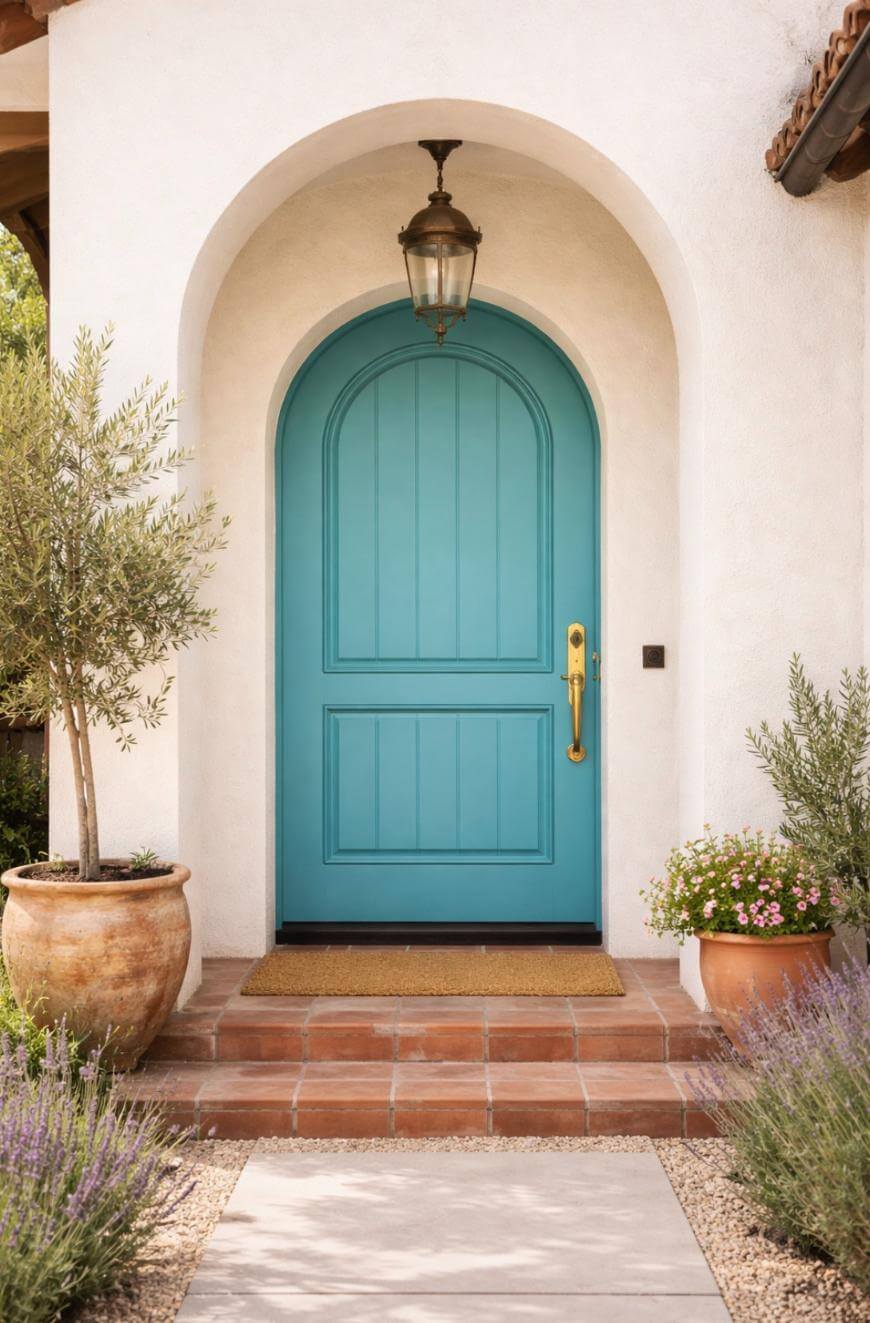
24. Soft Blush
Soft blush adds charm and looks surprisingly neutral from the curb.
It pairs beautifully with warm white trim and aged brass hardware.
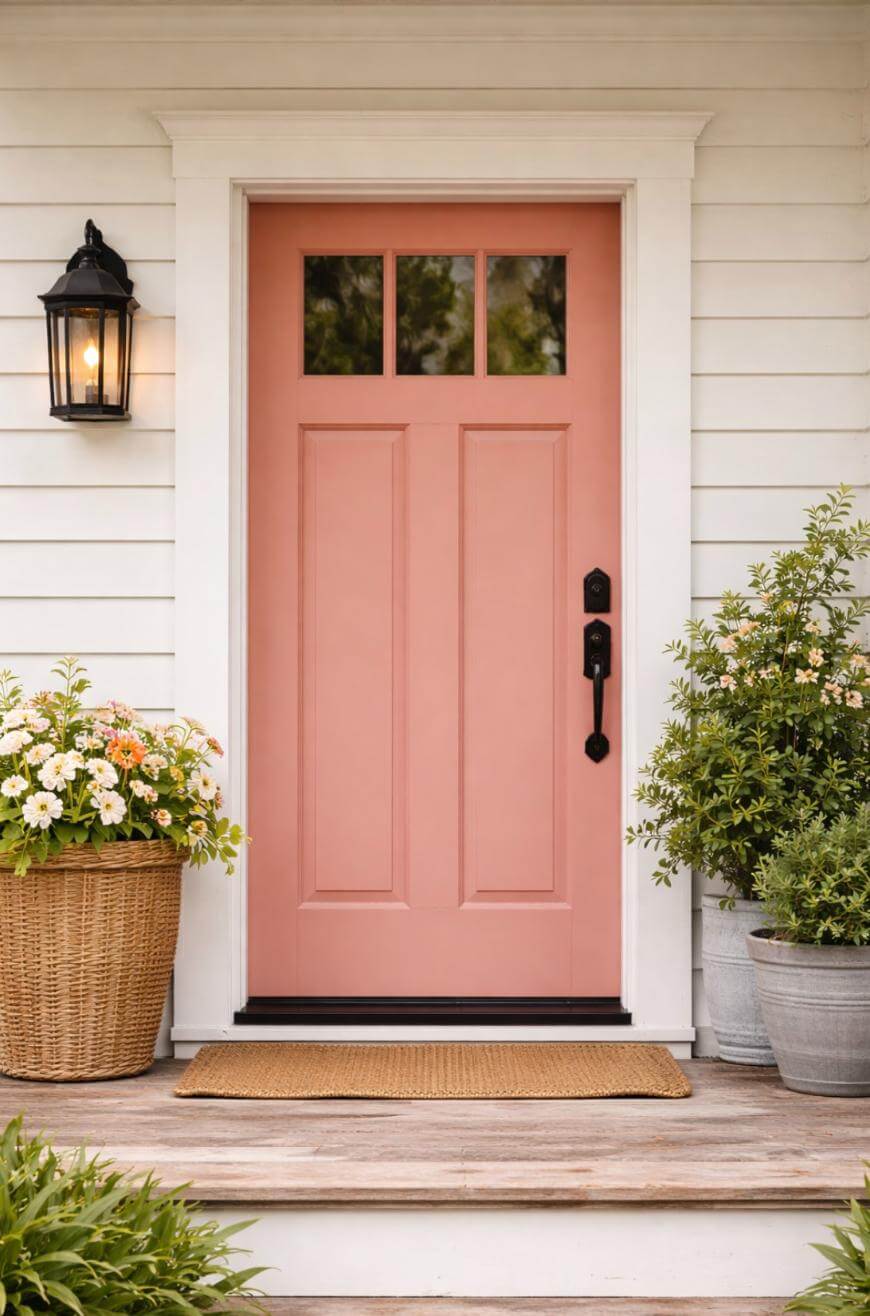
25. Dusty Rose
Dusty rose feels modern and earthy, not sweet, when it has enough gray in it.
It looks best on simple exteriors where the shape of the door can carry the style.
26. Plum
Plum brings depth and uniqueness while still feeling mature and design-forward.
If your landscaping is very green, plum creates a dramatic, high-end contrast.
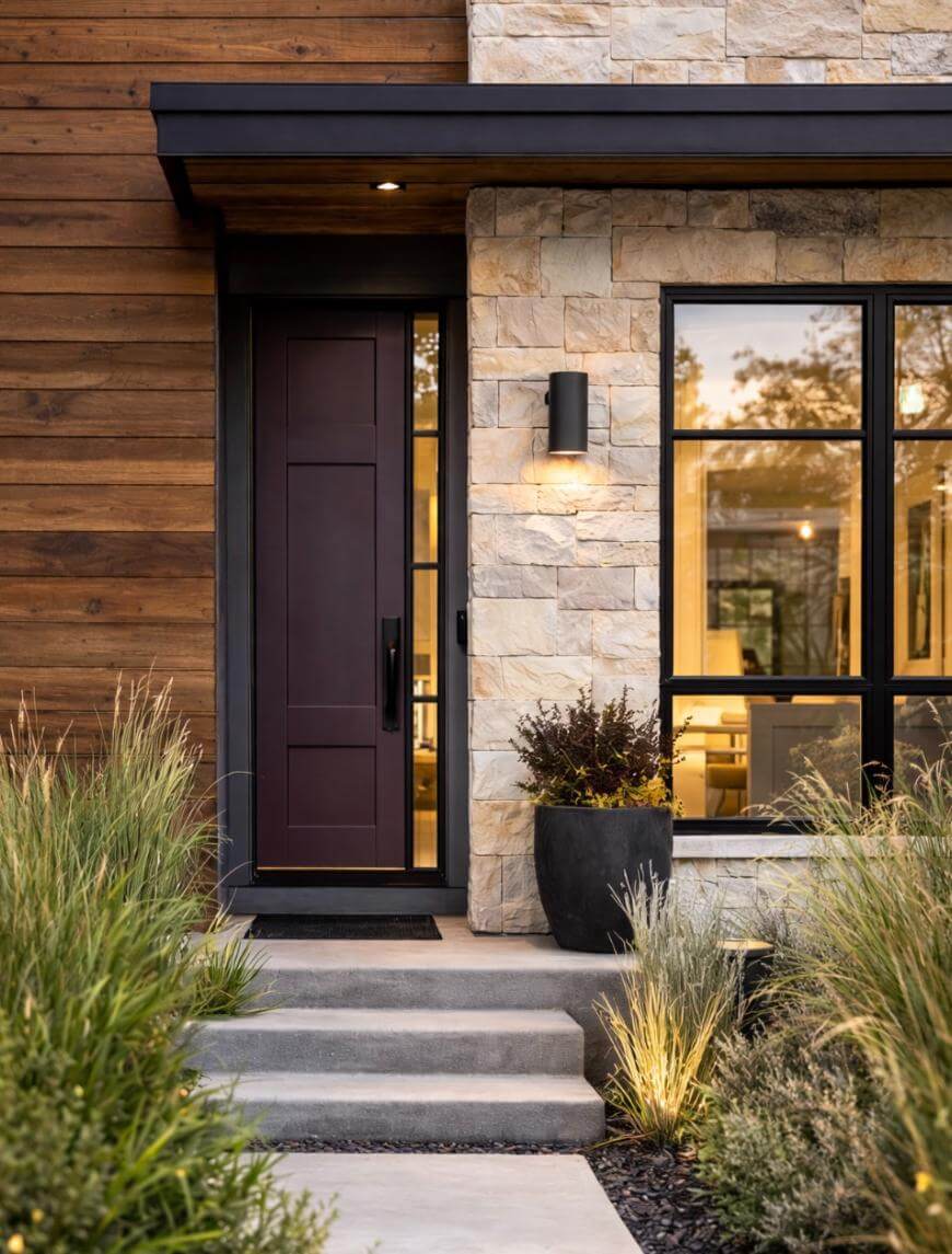
27. Eggplant
Eggplant reads nearly neutral from a distance but looks rich up close.
This is a great compromise when you want color but you do not want something bright.
28. Chocolate Brown
Chocolate brown feels traditional and cozy, especially with stonework and warm wood accents.
Choose a brown with a clear undertone (warm or cool) so it does not look muddy.
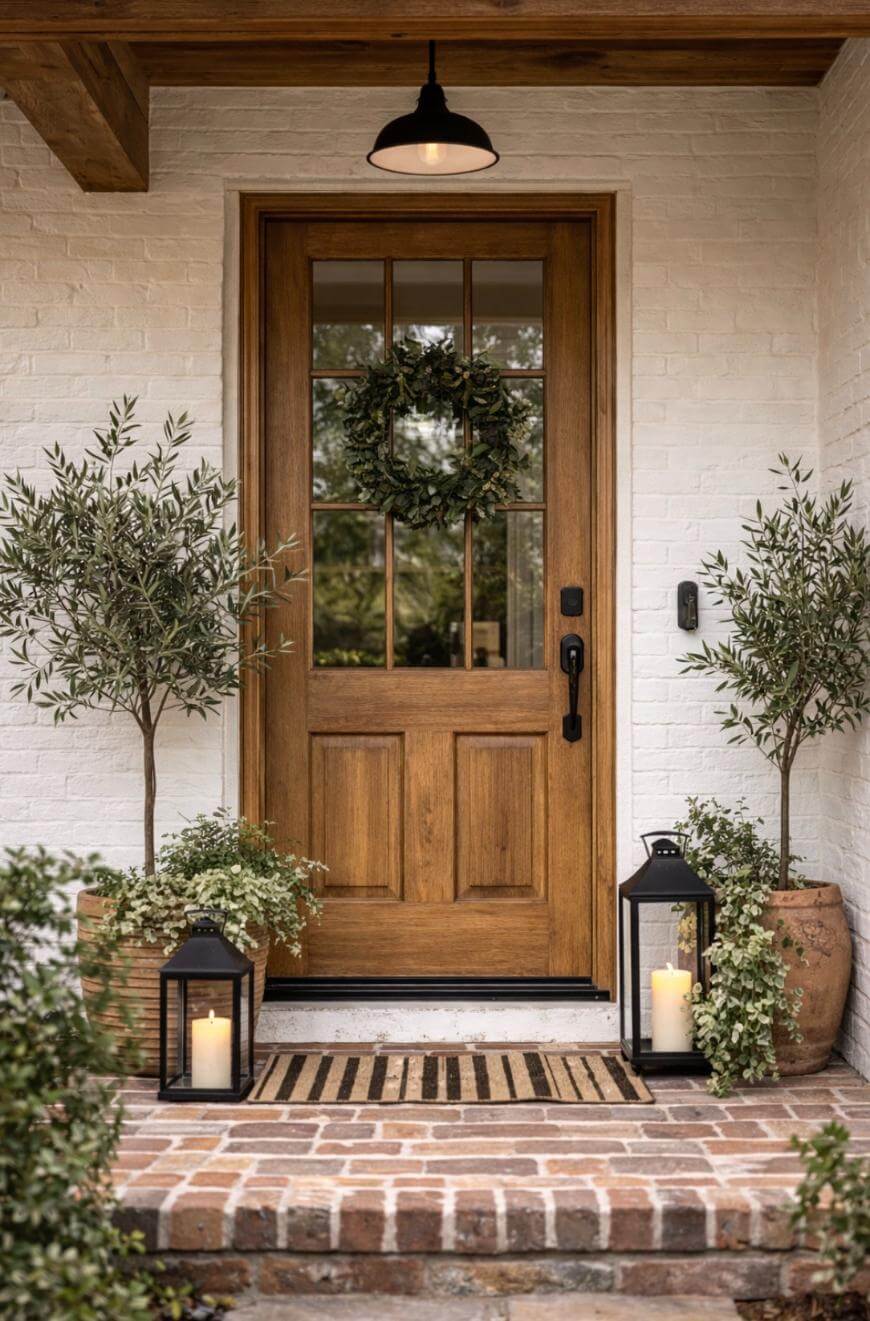
29. Natural Wood Stain
A stained wood door looks premium and timeless when the grain is the feature.
Use a UV-protective exterior topcoat if your door gets direct afternoon sun.
30. Matte-Look Blackened Bronze
Blackened bronze reads like a deep, brown-black that feels warmer than true black.
It is an easy win if your exterior has lots of warm tones and you want the hardware to blend in.
Conclusion
Pick one color that matches your home’s fixed materials, then commit to 2 solid coats in an exterior satin finish for the most reliable result. If you are unsure, test a $8–$12 sample on a poster board and view it morning, afternoon, and night before you paint the whole door.
Key Takeaways
Classic black and deep navy are the safest “looks good on almost everything” choices.
Match your door color to fixed materials like brick, stone, and roofing.
Exterior satin is a practical finish that balances cleanability and flaw-hiding.
Plan on 2 coats for most colors, especially reds, yellows, and blues.
Muted versions of bold colors usually look more expensive from the curb.
Hardware in black or brass can make the same color feel modern or traditional.
FAQ
How Do You Test Front Door Paint Colors Without Painting The Whole Door?
Use a sample on a large board and move it around your entry in different light. Check it at least 3 times in a day to catch undertone shifts.
What Paint Finish Looks Best On A Front Door?
Satin is the best default because it is durable and easier to clean than eggshell. It also hides texture better than glossy finishes.
Should Your Front Door Match Your Shutters Or Trim?
No, it does not have to match, but it should coordinate with the same undertone. If your trim is warm, avoid icy door colors that make the trim look yellow.
What Is The Most Common Mistake With A Bold Door Color?
Choosing a color that is too bright for the home’s fixed materials is the biggest issue. Picking a slightly muted version usually fixes the problem immediately.